What Will Professional Email Signatures Look Like in 2021?
- Written by News Co
An email signature is an essential element of your email marketing campaigns.
It shows your brand’s personality, introduces you to recipients, provides all the important contact details, and helps promote your products/services/content/etc.
If you have ever been tasked with making a decent email signature design, you would know it’s not easy to get right.
In this post, we will tell you how to use email signature software and make them look professional and up to date.

So, below are the top ten email signature trends to look for in 2021.
Trend #1: Professional photo instead of no photo at all
A professional headshot helps your email signature stand out, and it can add a personal touch to it as well.
If you regularly interact with customers via email, having a professional-looking photo in your signature is essential. But make sure that it complements rather than detracts from other signature elements.
Choose a nicely lit, sharp photo of yourself looking directly at the camera.
Your photo should demonstrate to recipients that you are capable, intelligent, and professional.
Avoid selfies and photos where you are not alone or in casual wear at the beach.
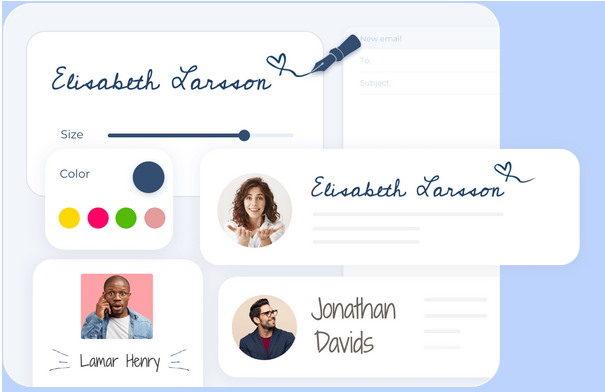
Trend #2: Handwritten signature
This is another good way to add a personal touch to your email.
Thanks to modern digital tools, you can easily draw signature using a mouse just like you would with a pen.

Trend #3: Three to four lines of contact information
In 2021, many people are going for a very basic (yet well designed) email signature without too many details.
Ideally, this should be three to four lines of text information.
If you want to add a disclaimer, keep its font smaller and choose a light grey color not to distract recipients from the main information.
When it comes to company-wide email signatures, those are treated more as a tool to create uniformity rather than to provide recipients with some ways to be contacted.
Trend #4: A set of social icons
We all know how popular are social networks these days.
Because of that, businesses choose social media as one of the main methods of keeping in touch with their customers.
As a consequence, we can see an increase in the number of email users adding social icons to their signatures.
Linking to social media in email signatures may result in more followers and more interactions with your content.
Keep in mind that too many icons can create a mess. So, be sure to limit the number to four-six icons.
Include links only to your most valuable channels.
Trend #5: Banners promoting certain things
Since using email signatures is a good way to market as you get in touch with other people via email, we can hardly imagine a modern signature without a promotional banner.
It helps promote anything like upcoming sales, the launch of a new release, recent blog posts, eBooks, guides, webinars, offline events, and more.
Marketing is not marketing without analytics. That’s why businesses use email signature software to track clicks and measure conversions from your email signature banners.
Furthermore, such software facilitates the process of updating email signature banners (even for the entire company with multiple employees).

Trend #6: Similar corporate signatures inside a company
Every email signature that leaves your company should be designed professionally and stay consistent for all employees.
But what about internal email communications?
In big companies, when it’s not easy to remember each employee, email signatures can help identify the sender in internal communications.
Once again, when you don’t have email signature software to centrally manage signatures, then it can not be easy to provide standardized signatures for all employees and update them quickly when necessary.
Trend #7: Low-contrast colors
As before, email signatures these days follow simple design cues.
It’s better to limit your color palette to two colors.
You can still choose complementary colors (e.g., blue and orange, yellow and purple), but in 2021, a mix of colors that are similar in depth to each other, and seem to blend together is in trend. For example, you can take two dark colors; or two medium colors, or two light colors and use them in your signature.
Generally, the primary color can be the same as your logo, and the secondary can be very similar to it — for example, blue and light blue, white and light blue, white and grey, etc.
Trend #8: Mobile optimization
Imagine how many people are regularly using their smartphones to check emails.
Having a layout that is too wide may cause a situation when mobile users won’t see your email signature correctly.
Today, many companies use vertical layouts as they work better for mobile phones.
Trend #9: One email signature is not enough
Although the advice doesn’t apply to design specifically, it really affects recipients’ experience when exchanging emails with you and your company representatives.
It would help if you used two email signatures: one for new emails and another one for replies within the same email thread. This will help you avoid a mess.
Trend #10: Intuitive templates
Everyone in your company should have an email signature to create uniformity. But shall everyone’s signatures have the same layout, or maybe some employees can have something different?
Ideally, all signatures should use the same template to be uniform but keep in mind that some departments may have a need to add other sections to their email signatures.
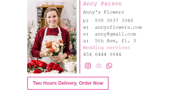
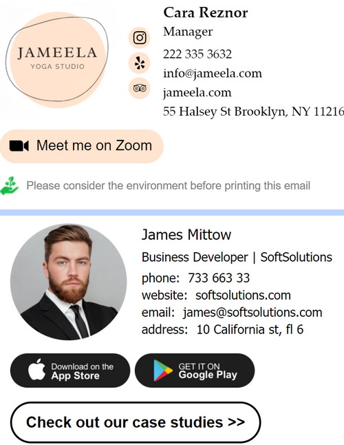
Below are a couple of examples of great email signature designs you will love.

Final words
A good email signature can benefit your business in a lot of ways. It can help you generate leads, drive traffic to your website, promote content, sell products & services, brand your emails & make them more personalized, etc.
But what does a good email signature look like in 2021?
We hope our ten ideas shared in this article will help you create a visually appealing email signature and stay on top in 2021.


